ZORO.com
As a UX Architect at Zoro.com I was the first associate hire on a team of 4 reporting directly to the manager of User Experience. By the end of my tenure I was the primary UX resource for an agile scrum team that oversaw the customer journey from homepage to add-to-cart button of a 4 million product eCommerce website. Being in this start-up-like environment provided amazing growth opportunities and exciting design challenges to solve as a part of a collaborative team.
“Lex’s skills, paired with his great attitude, make him one of the most pleasant people I have had the opportunity to work with.”
CASE STUDY: Home Page Redesign 2019
I took lead on the homepage redesign in Summer of 2018; advocating the customer's perspective to win the buy-in of the CMO. Of all the work I was able to accomplish at Zoro, from A/B testing landing pages, heuristic evaluations of user journeys, data analysis with GA and ClickTale, qualitative research with UserTesting.com and category taxonomy testing with Optimize Workshop; redesigning the company’s homepage in tandem with their re-branding efforts in 2019 was by far the most exciting.
Old and New Final Designs
OLD
NEW
Watch what new users had to say about the usability of the new homepage in a short trailer of clips cut from a larger usability test conducted with UserTesting.com.
The process was iterative, updating the homepage twice during the 6 month project. Below, you can see the final heat map comparison of new user engagement between the old and new designs showcasing how much we were able to improve the function of the page.
Heat maps comparing new user engagement between old and new designs
Discovery and Research
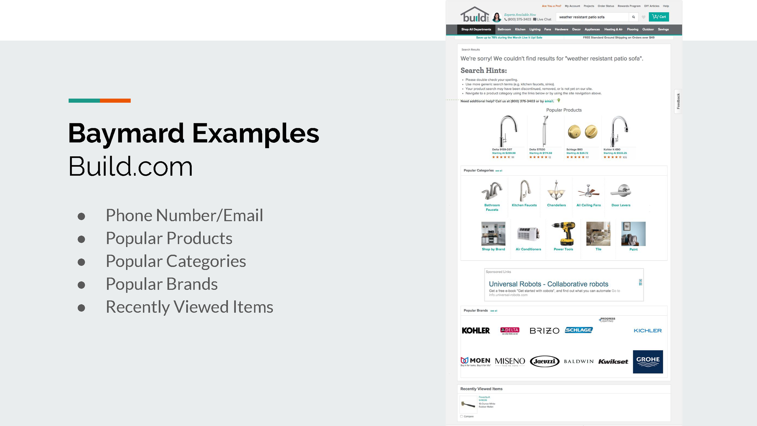
At the beginning of the design process a UI designer, TJ and I worked to make usability improvements informed by a heuristic evaluation I conducted with Baymard and stored in Jira.
I then ran an un-moderated test on UserTesting.com to give us a baseline for our current brand impression and gather qualitative usability feedback.
Brand impressions of product catalog
A main takeaway for the team in listening to customers in the above video was that only half of new users understood the kind of business Zoro was and therefore what they would think of buying from us; many of them assuming we only sold a limited supply of business needs similar to Home Depot.
Research Synthesis in Jira


Design Thinking with Stakeholders
Another UX Architect and I lead two separate 30 person internal design thinking workshops to gather feedback, ideas and concerns for the homepage.
Grouped sticky notes of workshop participants


Wireframing with Insights
Now that we had customer insights from synthesizing qualitative and quantitative research, as well as stakeholder needs and perspectives documented it was time to start designing!
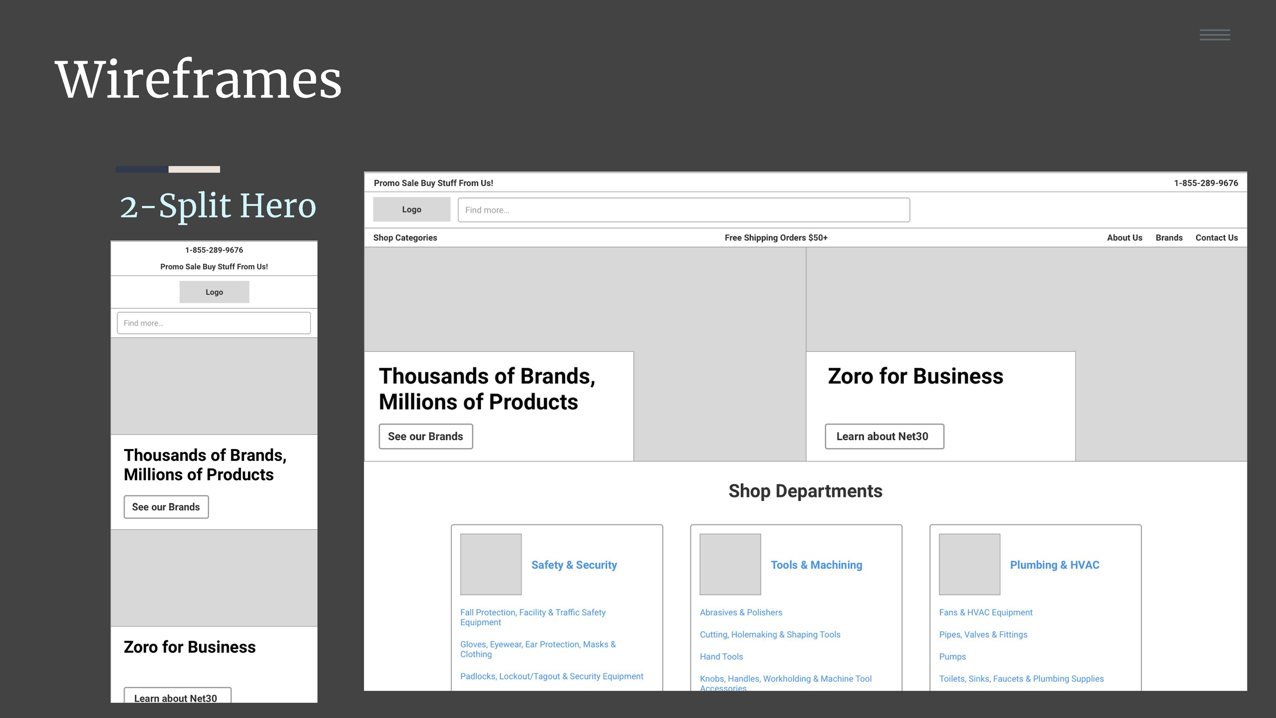
The first step is to white board as quickly and as much as possible, no design is a bad design the goal is to just produce as many different ideas as possible. It’s also good to design mobile first with any new feature or layout.
A design that didn’t make it past window whiteboard phase
We arrived at 4 unique designs and I presented the Sketch wire-frames in InVision with a brief description of their intent in order to gather design and developer feedback.


We did an A/B test as well as a follow up UserTesting test to validate our design choices, made minor iterative improvements and launched the final design in time for their 2019 new year media campaign.


CASE STUDY: Supplier Portal
User Story
“As a potential Zoro supplier, I would like to have a way to contact Zoro about selling my products on Zoro.com.”
Description
Build a portal that allows potential suppliers to enter their contact information so that Zoro can contact them about listing their products on Zoro.
Wireframes Gallery
CASE STUDY: Global Alert Outage Audit
Site-outage scenarios, particularly unplanned outages, are not great customer experiences and could have negatively impacted Zoro's credibility and trustworthiness. This document assessed the 15 existing outage alerts by both the impact of a potential outage on customers as well as the experience of the global alert solution. The goal was to asses the risk level for a given type of outage and then redesign how we responded to outages (planned or unplanned). If the existing notification experience was determined to be poor then a design solution was recommended.
SCALE OF IMPACT:
An overall impact scale, defined below, will be used to rate the different kinds of outages. This scale will use Frequency to rate how many total customers are likely to be affected. It will also use Severity to rate an outage by its effect on a customer’s ability to complete tasks given the financial impact of that task for the business. Together, frequency and severity ratings will help determine the scale of the impact and therefore what kind of system outage communication is necessary.
FREQUENCY:
How many of our customers are likely to experience the outage? ● A Few ; (0 - 25%) ● Several ; (26 - 49%) ● Most; (50 - 75%) ● Nearly All or All; (75 - 100%)
SEVERITY:
● Interruption : Users are only interrupted briefly and financial impact is limited.
● Disruptive : Users come to a full stop in what they are doing and have to actively resolve the issue to continue, likely having an impact on total conversions.
● Harmful : Users are unable to complete their task at hand, likely abandoning the site as a direct consequence and resulting in a direct loss of business
EXPERIENCE ASSESSMENT:
Jacob Nielsen’s 10 usability heuristics for design interfaces are used as a guide for assessing the current experience of a global banner alert when there is a system outage on Zoro. And the following 3 specific heuristics are explicitly referenced in the document, so they have been included below; with a description of how that principle should be applied in this context.
#1 Visibility of System Status : The system should always keep users informed about what is going on, through appropriate feedback within a reasonable time. Our communication of outages on Zoro must inform customers in appropriate ways of the status of our website and services.
#8 Aesthetic and Minimalist Design : Dialogues should not contain information which is irrelevant or rarely needed. Every extra unit of information in a dialogue competes with the relevant units of information and diminishes their relative visibility. Our communication of outages on Zoro needs to maintain a low signal-to-noise ratio in order to make accomplishing tasks easier.
#9 Help users recognize, diagnose, and recover from errors : Error messages should be expressed in plain language (no codes), precisely indicate the problem, and constructively suggest a solution. Our communication of outages will need to use precise and easy to understand language as well as suggest alternative ways for customers to accomplish their intended task.
Wire Solutions
CASE STUDY: Null Results Page
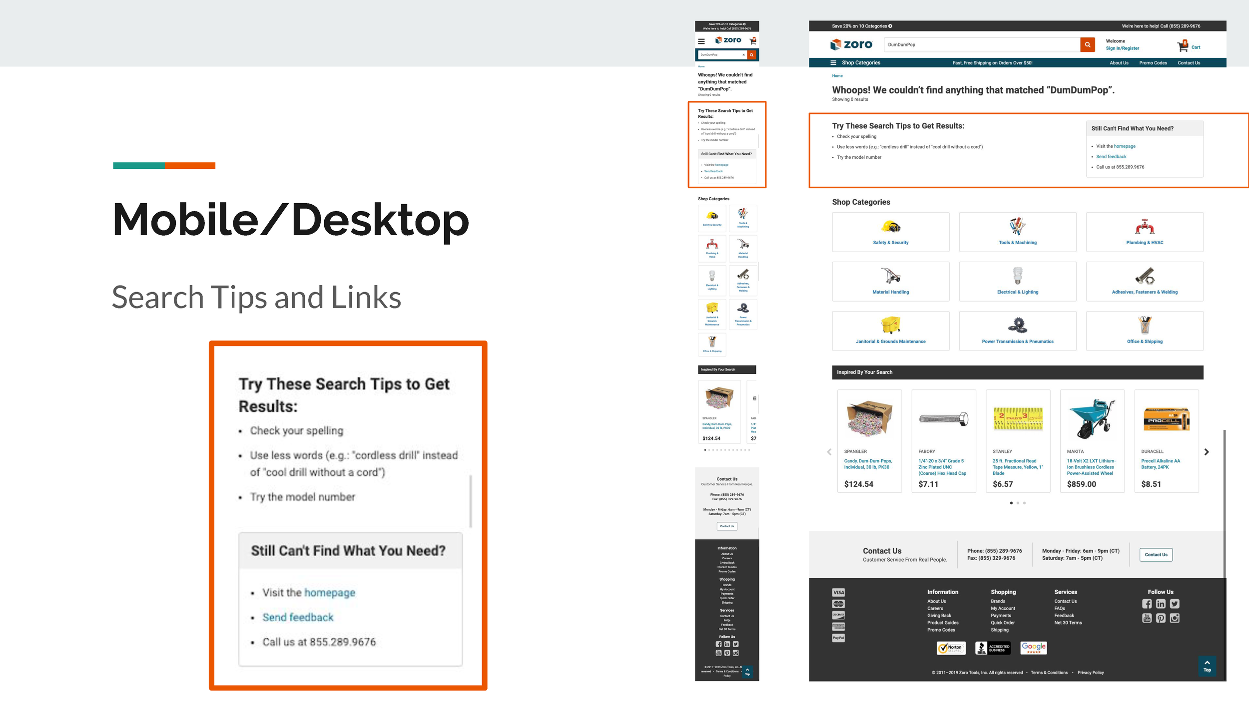
Our Null Search results page had, at one point, a 53% exit rate. Once an analyst and I dived in we learned there were a lot of bots doing searches to crawl our site for inventory checks. So the real exit rate was somewhere around 45%. I did an additional qualitative assessment using our tool ClickTale to understand what customers may be doing on the page and then proposed a quick solution that we ended up implementing on the site. Notice in the YouTube link how customers on mobile were willing to scroll to the bottom of the page and so were more likely to see the carousel of alternate products. This proved to be an easy band-aid to get us to 31% while we worked on our algorithm to result in less null results over all.


Desktop Re-creation of User Path
ClickTale Analysis Video
CASE STUDY: Category Taxonomy
With 4 million+ products to browse through, a well organized taxonomy of labeling and product structure was critical. I participated in major taxonomy redesign work while at Zoro as well as individual sections of taxonomy treejack and card sorting testing using Optimal Workshop.
Deck Presentation Report


