Delta Institute
As a Product Design Intern at Delta Institute I worked on a startup called DeltaLumin, creating a service website for social impact. Through IDEO’s design thinking process, user research and a 3 month pilot study we were able to help low-income families and seniors reduce their carbon footprint through smart-meter engagement.
CASE STUDY: DeltaLumin
Data Driven Carbon Reduction
DeltaLumin is a software-driven product focused on low-moderate income utility customers. It utilizes data made available by the smart grid to serve personal information about current and past spending to change customer behavior and to work with what motivates them to keep up to date with their bills, use energy more wisely, and make smarter purchasing decisions.
Piloted Products
Spending Forecast
This tested if energy spending updates at a shorter interval (daily rather than monthly) leads to increased levels of engagement over those receiving traditional monthly bills.
Spending Diagnosis
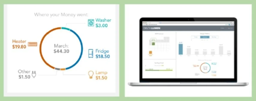
This tested if appliance-level energy consumption information is a more accessible illumination of energy use leading to increased levels of engagement over those receiving traditional monthly bills.
Goal Setting
This tested if self-guided goal setting helped users to select and lower their usage goal over time. They received regular updates to gauge progress and feedback towards small achievable goals, helping them to understand the impact and control they can have.
Program Match
This tested if a curated list of existing utility programs based on actual household energy use data will lead to increased levels of engagement over those receiving traditional monthly bills.
Why is this project important?
The state of Illinois mandated and funded smart meter rollouts for all homeowners by December 2018. This new tool is extremely helpful for accurate and up-to-date billing and usage reports, but requires a threshold of home electricity knowledge that under-served markets struggle to engage and understand. Research shows that the largest source of a low-income family’s carbon footprint comes from energy use in and around their home; and just being more informed about their energy bill and usage habits correlates with a reduction in that carbon footprint.
How I participated
I lead break-off groups during the monthly workshop sessions of the pilot study and completed design jobs like data visualization and promotional materials. I utilized my past experience with Salesforce to help implement a CRM for the study.
The Process
The following is broken up into two parts. The first focuses on projects I worked on independently and the second is a general overview of the entire project that I participated in creating. (The second section includes images and copy summarized or quoted directly from the year one report at DeltaLumin.org.)
Part 1: Independent Work
One of the first data visualizations I worked on helped explain just how much greenhouse gas emissions are generated from a home’s energy use. This was in line with our initial assumption that illuminating through education would result in consumer behavior change. If a family had a better understanding of their actions it would encourage better energy consumption behavior, like turning lights and electronics off when not in use.
I explored different color visuals, deciding between highlighting specific data and reframing the conversation with weather and time of day reminders. I settled on the concept of translating the opaque terminology of Greenhouse Gas production into more tangible and relatable ideas. Often the conversation around emissions is done with metric tons and KWhs as monthly averages. These abstract and too-large-to-relate to frameworks are good for boards and city governance conversations but don’t help a low-income or senior household understand how their behavior directly contributes to pollution. I wanted a visual reference closer to home so I brainstormed how we might explain the measurement of gas using balloons.
After a few quick calculations I was able to estimate exactly how many balloons of greenhouse gas emissions are generated per Kilowatt of energy used. I then took a teammates annual household energy data and selected one day to visualize how much greenhouse gas would have been generated that day.
In illustrator I then created sets of balloons at 1, 2, 3, 4, 5, 10, 15, 20, 25, 30, 50, 75 and 100 so I could easily reproduce and consistently represent any amount of greenhouse gas emission.
Ultimately carbon emission education did not prove to be a useful motivator with low income families and senior households. Everyone cared about the environment on paper but when it came to actual behavior change our users couldn't afford to make the necessary changes to impact their carbon footprint. So we pivoted to focus more on bill reduction/management and usage education to provide a sense of control over energy bills.
Magnets
We needed a way to help our pilot study participants keep track of our website and contact information but also what their assigned login ID would be. Since we would be assigning them onsite during a monthly meeting it needed to be a little more robust than just a nametage.
I created the magnet template because it would be cheap to print ourselves directly onto magnetic paper designed for this purpose. Participants could attach it to their fridge and have all the necessary information available.
Initially I had created the template in Illustrator but recreated it as a Publisher document in Microsoft office. Laptops with access to Adobe Suite were rare in the office and in order to have the template accessible to more staff it made sense to recreate it there.
Visualizing cyclical energy patterns
I made a prototype wire-frame for the main landing page of the website early on in the process. It would showcase weather patterns, time of day and actual cost (in pennies) of energy used. Time of day and weather patterns have a predictable effect on the cost of energy and correlated carbon emission. With the smart meter able to provide hourly updates on energy use it would be valuable to connect the price, the weather and individual consumption habits together in one visualization. Expected forecast of peak energy times and resulting prices could then also be communicated to allow users to implement energy reduction habits in anticipation.
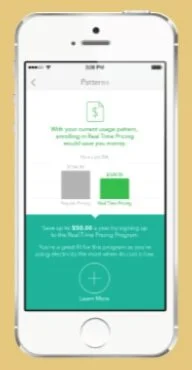
There are two types of price plans for residential consumers of electricity in IL. The normal rate used by a majority of Illinois residents is BES, Basic Electricity Service, which charges a flat rate per KWh of electricity; while RTP, Real Time Pricing, charges the current market value of energy at the time of consumption. RTP would reduce the cost of a user's daily energy bill over time, provided you reduce use during the occasional surge pricing on very hot afternoons.
It would require, however, a lot of explanation and ultimately burden the low income family member with navigating market value energy prices. This visualization was therfore abandoned because the value relied on enrolling in Real Time Pricing (RTP). Most seniors also reported not wanting to sacrifice comfort of living in any way to reduce carbon emissions. This burden proved too troublesome, either in cost of education or ability to understand the risks in order to take advantage of daily energy price fluctuation.
Part 2: Team Work
We worked directly with consumers to understand how they use and manage their energy and then developed effective strategies for behavior change. To understand if the illumination of energy use data lead low-income energy consumers to engage with their energy use beyond the level of engagement that occurs with the use of traditional monthly bills.
Throughout the pilot, the DeltaLumin team asked participants to report both conservation actions (changing behaviors to use less energy) and efficiency actions (acquiring energy-using equipment that uses less energy).
The number of participants who increased the number of efficiency actions taken each month increased dramatically between the second and third months of the pilot.
Participants were required to attend monthly in-person events to share reactions and insights related to the features they interacted with the previous month. Qualitative data was collected in the form of responses to open-ended discussion questions and reactions to interactive group activities.
Monthly surveys were distributed and completed at each monthly workshop. These were mixed method surveys with an emphasis on close-ended questions, but with open-ended questions included as necessary to collect information about opinions, motivations, and intentions related to energy use generally and treatments more specifically.
Email views and/or website visits were tracked by user and by date/time to aid in the analysis of changes in both energy use seen in the collected energy use data and/or changes in opinions, motivations, and intentions captured in monthly surveys.
In an attempt to better understand why we observed this increase in energy-related action and intentions, we also looked at the relationship between the specific information communicated to participants in each feature and their reported actions and intentions.
We hypothesize that participants told they were likely to overspend will take more action than participants told they are on track.
Pilot participants received an Appliance Spending Diagnosis in each of their mid- and end-of-month energy updates. This feature illustrated the five appliances or electronic devices that were using the greatest amount of energy--and thus costing them the most money. It was difficult to measure the relationship between appliance-level communication and reported intention or action, however, we did find that participants liked and appreciated the feature as a way to identify opportunities for savings.
In months two and three of the pilot, participants received communication about their progress toward their energy savings goals in their mid- and end-of-month energy updates. For month two, all participants were assigned a suggested goal of 5% savings. During the workshop in advance of month three, participants were asked to set their own energy savings goal. We expected to see significantly more engagement in the month that they set their own goals, but observed no change in engagement levels corresponding to assigned vs. self-selected goals.
Next Steps
Can ComEd recover late payment waivers?
What are the disbursements of the Supplemental Low-Income Energy Fund - are they near their admin cap of 10%?
Followup: comparison to Rubicon (waste management startup).
Budget billing with comparison to income tax withholding.


