Venmo Charity
Millennials make more individual donations to charitable causes than any generation before them so why aren’t they making those donations on the Venmo platform? In this 4 person class project we designed new features for donating to nonprofits inside the existing Venmo experience to help bridge the gap between charity organizations and Venmo users.
CASE STUDY: Venmo Charity
Increasing donations by enabling nonprofit accounts
Our motto became small tweaks for a huge impact. Our research suggested that sustained engagement on the charity’s end was the missing ingredient to increased donations taking place on Venmo. We added new features providing for charities' needs, like a verified charity badge, opt-in mailing list post donation and sub-profiles for causes that better serve existing fundraising models of annual events and peer-to-peer donation challenges. We also added a float-up model for stories in the feed where a friend has “donated” in order to enable viral donation campaigns. Charities will now be able to better engage Millennial donors through the app and confidently use the phrase “Just Venmo us!”
Why is this project important?
Charitable donations by individuals is a large and growing segment of the small-medium payments market which Venmo should move into. It coincides with their core vision of connecting the world through payments and a majority of Millennials, their main user base, regularly make charitable donations outside the app.
The Process
I volunteered as project manager and guided us through an aggressive 10 day design sprint. We were able to add real value to a well known product through minor feature changes that aligned with Venmo’s current experience and core company vision. We created a high-resolution, high-fidelity prototype that solved the actual problems that charities and Millennial donors face during the fundraising process.
First, I asked the team to share two things with me:
What skill are you excited to use for this project?
What goal do you have for personal improvement?
I used this to help us decide who would be in charge of what phases of our design process. Then I had us share a general goal we had for the project as a group. We all agreed that we wanted a hi-fidelity/hi-resolution prototype for our portfolios and forecasted out a possible timeline, to be updated as we moved along.
Research
We immediately realized we had to have the interview phase done by end of day tomorrow and get started on the insight synthesis that same night. So we developed our approach, selecting 3 categories of individuals to interview based on our defined problem context;
Venmo “power” users
People who donate regularly
Charity workers who collect donations.
We contacted everyone in our personal network who fit at least one of those categories and scheduled phone interview times.
We interviewed 3 people in each category for a total of 9. Some of our interview subjects were both power donors and Venmo users already or visa-versa. We prioritized screened individuals in our personal network who were available for a 15-20min phone interview the follow day. As one teammate would be on the phone conducting an interview the rest of us would pour over the previous interview to create the following three types of personas. We created personas for all 9 subjects, including a map of their relevant experience using the 5 E's framework of Entice, Enter, Engage, Exit and Extend.
Venmo Users
Charity Donors
Nonprofit Managers
Insight Synthesis
One of the first insights we found was when comparing the experience maps together. The structure of the 5 Es framework allowed us to make comparisons quickly between different experiences. The chart below illustrates the similarities in the way charities conduct their digital donation process and the way Venmo sets up their payment experience.
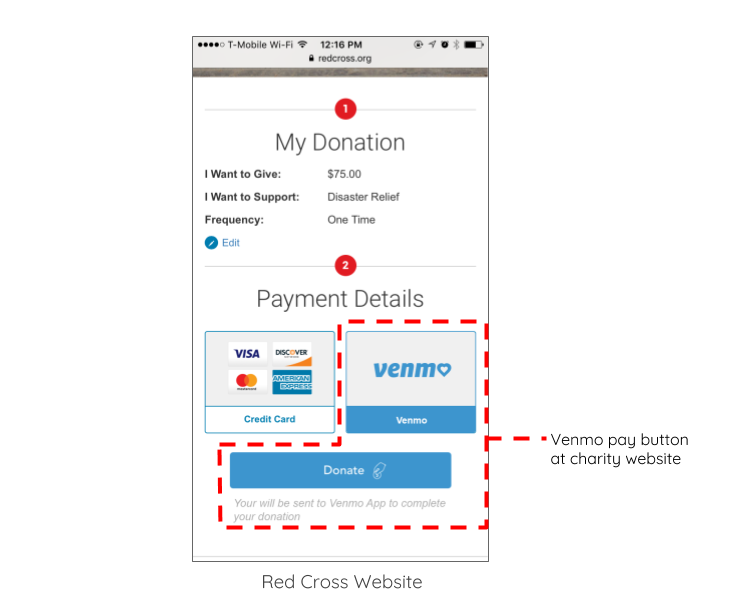
We realized that the existing customer experiences of Venmo users making a payment and charities accepting donations was virtually the same. Charities were currently using mobile apps or having donors create profiles on their websites. So a reason that charitable donations weren't being made more on the Venmo platform must lie somewhere at the beginning and end of the experience; the Entice and Extend moments of the payment process.
The reason that charitable donations aren’t being made more frequently on the Venmo platform must lie somewhere at the Entice and Extend moments of the payment process.
One of the key difference we uncovered was that charities didn't have a way to extend the relationship after a donation. And from our research we knew that the extension of the relationship can be more valuable than the donation itself.
Design principles:
Based on the insights we gathered during our research we built consenses around 4 design principles that we would follow as a team during the next phase of the project.
And then from our comparison between existing user experiences of online charity donations and Venmo payment experiences we created two ideal experiences for both parties.
Ideal Charity Experience
Ideal Venmo User Experience
Experience Mapping
What is the story we want users to experience?
We could deduce the type of features to pursue rather easily thanks to our 5Es comparison maps. But having a powerful shared story as a team will help use make decisions quickly during iteration. It was especially valuable given the projects 10 day timeline. So we crafted a story for both a charity as well as a Venmo user.
Charity Story Board
Venmo User Story Board
Feature Iteration
We took story boards and started paper prototyping both features and icons. In keeping with the small tweaks for big impact we anticipated iconography being an important communication tool.
Usability Testing
Once we were happy with the paper sketches we then made digital wireframes in sketch and were able to start usability testing. We found 3 testers for both feature types, Venmo users and charity employees who had Venmo accounts. We then tested their respective scenarios.
Feedback and Updated Wires
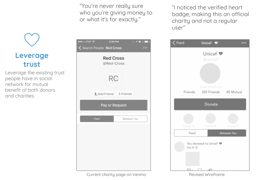
We were able to validate our assumption about using a heart badge when a charity account had been verified with their tax ID number and 501c3 satus. Users knew exactly what the badge meant without explanation and reported trusting the charities profile more because of it. And this particular update fulfilled our design principle to leverage existing trust between a charity and their stakeholders.
Adding a charity search feature to the main menu allowed users to seek out their organizations. And helped communicate that the profile they were looking for was not a normal person.
This particular feature took a second round of iteration. The first time we tested it all three users selected No and were annoyed with the request. We thought that changing the language to be less ambiguous about exactly what was going to happen might fix this aversion to continuing the relationship post donation. And users all agreed. During the second round of testing users were happy to continue the relationship once it was made clear that the contact was specifically a newsletter.
Key Feature Change Comparisons
Features for Venmo Users
Features for Charity Managers
Personal Growth
By day 3 of the project I realized I was carrying some major assumptions about what a potential solution would look like. The pressure of the aggressive project timeline was encouraging me to take shortcuts in the design process and it started to prevent me from managing the project effectively. Perhaps my most valuable takeaway from this project was learning the power of vulnerability when working with others through a creative process. Acknowledging out loud to my team that I was gunning for these assumed solutions disarmed me, and being disarmed I was more neutral during the design principle generation stage. It allowed me to once again adopt the posture of open creativity necessary for both effective solution generation as well as team leadership.


