Freelance Design
As a freelance UX Designer I provide full digital product creation and consulting support; from UI asset design to heuristic evaluations and category taxonomy creation.
CASE STUDY: Colibri Group
Category Taxonomy
Colibri Group is an e-learning company with diverse brands across multiple nationwide industries. I was brought onto their “Product and Format Offerings” project as a Lead UX Architect in order to help them create and groom a better category taxonomy architecture as well as help design a better product list page. The project lasted 4 months with research, testing and design phases. I was able to establish a process for adding or changing product categories as well as a prototype of the new components for their design system. The resulting work creates an improved product list page experience on both Desktop and Mobile devices.
Project Hypothesis
As many projects often start, the “Format and Offering” work was initiated out of fear. A previously acquired brand, Western Schools, had suddenly begun loosing customers and profit.
“Western Schools revenue has continued to decline since its move to our common platform. We believe the reason for that decline is that customers do not realize they are getting a hard copy book with their purchase until they actually get to the cart/checkout.”
Heuristic Evaluation
It became clear while evaluating the website for general UX best practice that the Western Nurses were not the only customer segment to be concerned about. There were affordances missing from both Desktop and especially Mobile e-commerce usability that would likely cause many customers to become disoriented while shopping. I was therefore most interested in finding out what customer’s thought about the products that were for sale as well as the mental model they constructed of the catalog while shopping.


Usability Research
Looking at a combination of the product list page data as well as general heuristic issues it became clear we needed to listen to customers directly. In order to understand what products they thought were being sold as well as how they chose to navigate and shop those products.
The test needed to simulate an organic search user who lands directly on the page and doesn’t navigate. The potential testers needed to have not heard of Colibri before or have shopped their website. A Screener was created to identify users who have at least used a continuing education provider in the past. This wouldn’t guarantee that we would send them to the relevant profession but that they would be familiar with state regulated continuing education in general.


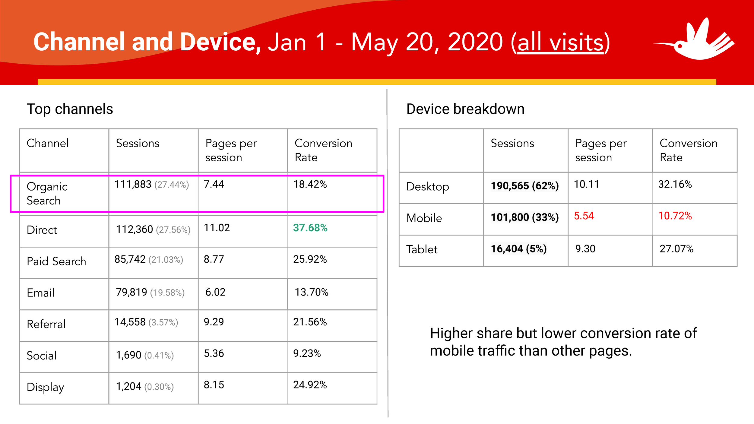
Page Data
Focusing on the most constrained user type: Organic Search Mobile Users.
Mobile organics search users know the least about the company and the products on the page because they arrive at the product list page directly from a google search. They need the most interface consideration because they will need to orient themselves within the larger website, learn the kinds of products that are available and do it with the smallest viewport. This customer became the key person to design for because if we could solve their needs then it would account for the majority of customer needs at this moment in the shopping journey.
Proposed Component Designs
Early Stage Wireframe
I designed components to seamlessly fit within a larger design system. Some components were the same for Desktop and Mobile and others would be different in order to respond best to the screen width sizes while still supporting a user's task at that moment in the journey. They would provide important new functionality but still feel and look like the same website. They would also be brand agnostic, able to be added to any of Colibri Group’s other brand design systems just as seamlessly. And finally added to the design system documentation for continued use.
Design System Documentation
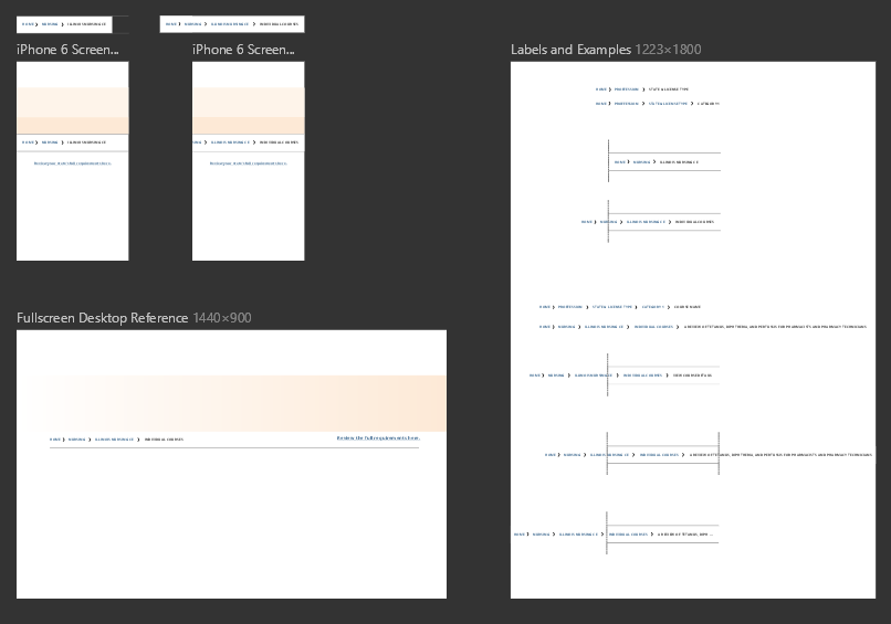
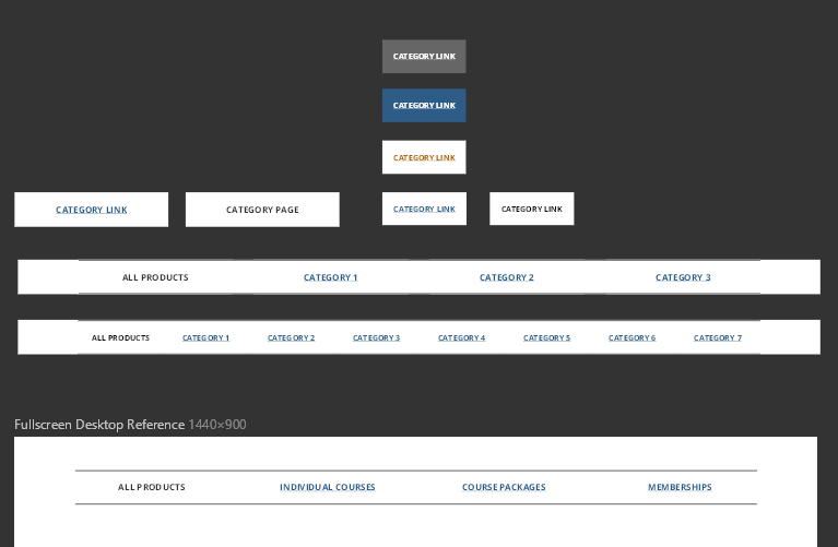
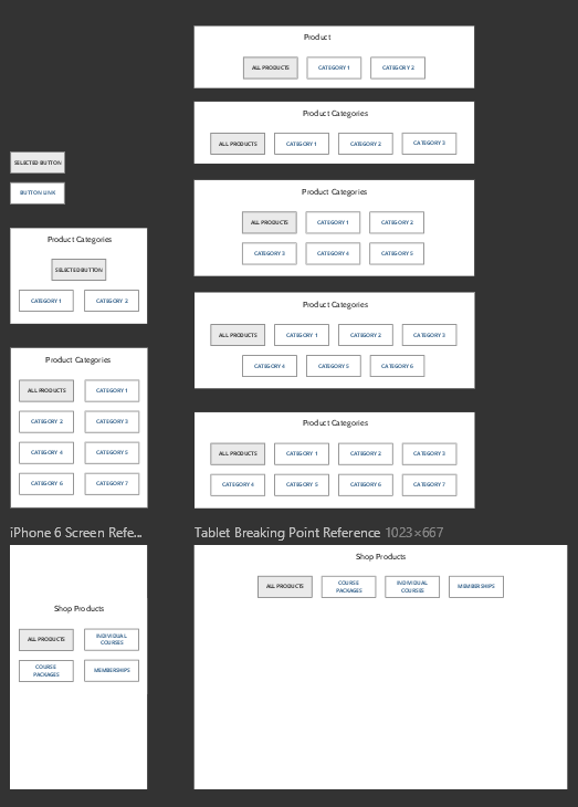
Higher Resolution Components and Architecture


Teaching Process
There were two kinds of processes that had to be documented and shared with business stakeholders. The first was a better understanding of category taxonomy and how the architecture of an ecommerce website would mirror the category taxonomy of their product catalog. The new components would be relevant and used depending on how they would groom their category taxonomy. There were two sets of rules therefore; how to merchandise categories of products based on their user personas and then the rules for how to utilize the new category navigation components on the page itself.


InVision Prototypes
The first business unit to launch with the new components would be Indiana Physical Therapy Continuing Education Courses, under the Elite Healthcare brand. This InVision prototype showed the new components in action on both the Desktop and Mobile viewports.
Mobile Prototype Link
Desktop Prototype Link
CASE STUDY: R&K Roofing
Logo and Ad refresh
R&K Roofing of Florida needed a new logo and brand identity for their company. Based on their budget I created a logo refresh and both digital and print graphic materials on an as-needed basis. The existing logo was scattered in multiple different forms across all platforms; from business cards and e-mail sign-offs to magazine adds and printed door hangers. They all lacked consistency and only avoided confusing customers because R&K is a unique enough string of letters without any local copycats. Lightning, ironically, was the only repeated visual theme.
New simplified logo for all media needs
My goal was to bring a consistent voice and brand identity to R&K that reflected their local and family business values elegantly while still communicating their professional and large market capabilities. I started with the logo as a ground zero; getting everyone on their teams excited for and using the new logo would be key to future adoption and adherence to a consistent visual identity.
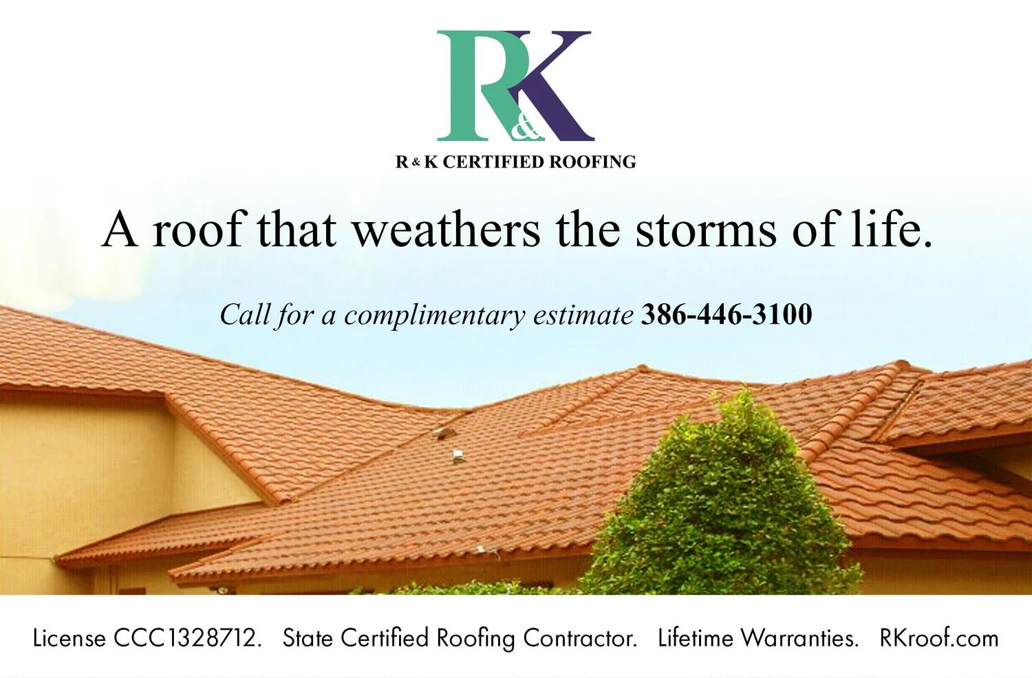
New half magazine ad
Newspaper test-run
I discovered the reason that the logo was so inconsistent across platforms was because R&K delegated its recreation to whichever business was making their materials. This abdication of design meant that the t-shirt company made their version of the logo which was different from the website hosting gal and different from the magazine ad guy. I gathered the contact information for all of the small businesses and informed them of the logo update, and then to assure compliance made myself their new contact for all future work through R&K.
The first test run of the logo would be with a classified ad for crew managers in an expanding market area of north Florida. I encouraged them to invest the money to track the ROI of their marketing. We ran both a printed ad with a dedicated phone number to track conversion and a digital ad with e-mail through the paper’s system to track those as well. We were able to validate through this tracking that classified ads were useless in converting a single lead for this position. The traditional word of mouth networking was more successful, and in the future the budget for classifieds can be devoted entirely to an employee referral reward system.
R&K had been awarded people’s choice for Flagler county two years running. It is traditional for a nominated company to run an ad with the People’s Choice magazine released every year. This would be an opportunity to visually remind the community of R&K’s value and ability. I wrote the copy and created the ad using photoshop and illustrator. Terracotta is not the most sold roof by the company but it is the roof most closely associated with wealth and is a status symbol.
R&K has expanded to a second office location and needed an outdoor sign designed as well as the indoor glass door branded with their logo. They e-mailed me a specs document and I created the designs over the course of the next day.
“Maybe move the logo and put a small roof over it? Make the phone number red? We need it to stand out. Right now your eye is drawn to the cake for example and you instantly understand its a cake company.”
CASE STUDY: Men’s Room
This years valentines party was a joint effort with the local LGBT rugby team the Chicago Dragons. The theme and main image would need to do double duty as both an in-store promotional poster and as digital invitations on Facebook, Instagram and e-mail. I created the message and theme of the party tagline around a new blindfold mask being featured in the store. Utilizing stock photos and the products online materials I created the main image and selected fonts and wrote the copy to communicate both the shops brand and the feel of the event.
Facebook event page
My client had received TV add time on televisions around a beerfest event as a part of their sponsorship. Based on how much they wanted to spend we went with a PNG image that would later be translated into a MOV file for the events televisions. It needed to communicate their brand to potentially drunk viewers and be comprehensible within 10 seconds. After a few iterations we went with a promotional sale of %10 off in the store if a customer showed their social media or camera-phone photos of the event to staff. The staff would then record the sale as “beerfestSale” to keep track of customer response rate throughout the month. I incorporated a beer mug into the stores logo along with the message of the sale to efficiently communicate the stores brand as well as offer.


